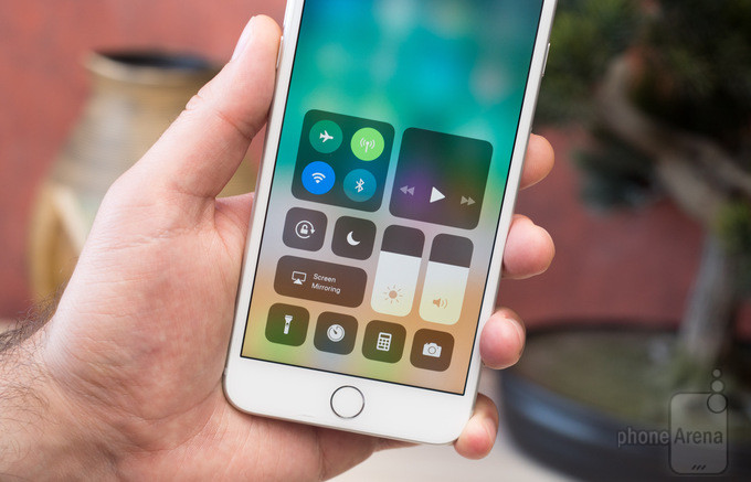
Smartphone giant, Apple is releasing the new iOS 11 to the world today, and it has a big change that will cause iPhone users to have a surprising reaction. Even though the major UI changes are on the iPad in iOS 11, the Control Center has been changed and it is very different. Even though it looks ugly initially, but when discovered, it has few good changes as well.
Starting with the good changes, the user can now choose whatever quick shortcuts they want to see in the Control Center. There are options of adding things like Waller, alarms, low power mode and many other accessibility options. This makes the Control Center more useful than it was before, even if you can not place all the things you want to, on the Control Center. Moreover, it is also more easier to control the music, as you do not need to change between panels to use the controls.
Along with that, the Airplane mode is now more efficient. If the user is operating with a Wi-Fi or Bluetooth, the enabling of Airplane mode will not disable those toggles. This is obviously helpful if you are using Bluetooth or Wi-Fi when on a plane. Moreover, you can also use the cellular radio without turning off the Airplane mode if you want to.
The Control Center of iOS 10 was better in few aspectsMoving on to the bad features of this version of iOS. Even if the user gets used to using the new Control Center, it will be difficult for him to identify a few applications, as all icons look very similar with not a lot of visual difference to see them apart. In this aspect, the iOS 10 Control Center was better, having a strong blur effect in the background of the application icon.
Another change in the new version seems that the Night Shift might have faded away from the Control Center. Even though it hasn’t, Apple has hidden it besides the brightness slider to turn the night mode on or off. This makes it unnecessary to tap and hold on to the display, while it could easily be used a quick toggle.
Moreover, Apple’s utilization of the 3D touch in the new Control Center is baffling. The 3D touch is effected by ascertainable issues across the iOS and watchOS, and you really do not know what you might get if you tap and hold on any option on the display. The 3D Touch can’t be used on the alarms shortcuts or the low power mode shortcut in the Control Center. However, it can be used with flashlight, Waller and many other things.
From an overall point of view, the new Control Center in the iOS 11, is an upgrade from the iOS 10’s Control Center, and the user will definitely get used to it. Even though it is better in design and usability sector, it also seems a bit unfinished. Whatever, it might be, Apple users should surely enjoy the new version.

Nicholas is a dedicated and experienced author of this tech blog. He wants to be helpful and offer great content to his readers, but he also needs to make sure that the site is profitable so it can continue running. If you have any questions or concerns about our work please don’t hesitate to contact us!

